"I solemnly swear I am up to no good."
-- Harry Potter
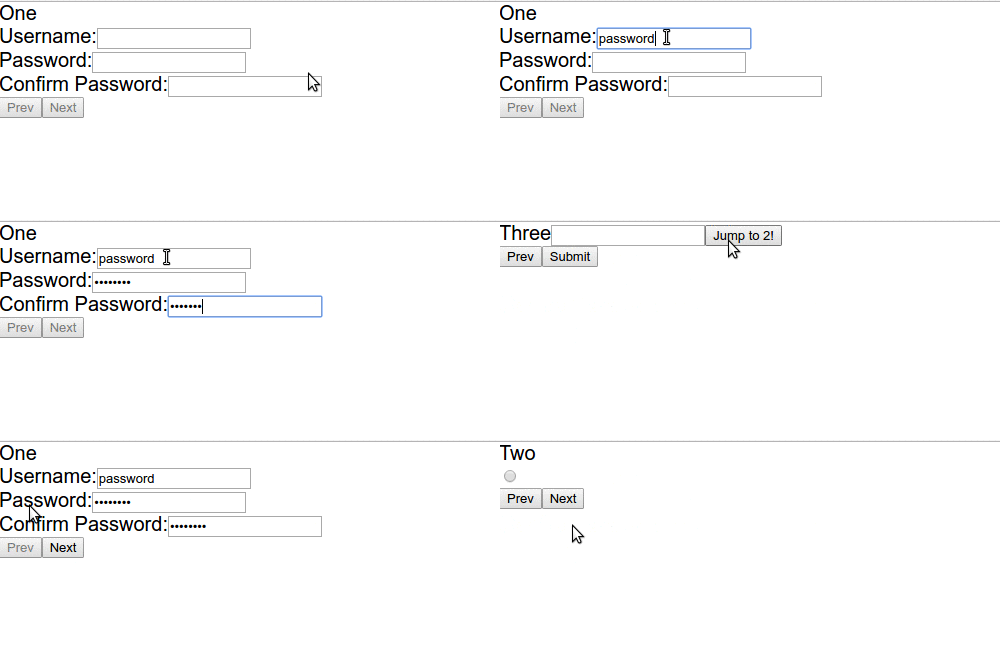
react-harry-potter is a React component library that helps you build a multi-step control flow, otherwise known as a Wizard. You're responsible for actually building the screens, and then stating where you want them to be placed, but beyond that react-harry-potter actually maintains the flow-related state.
As a developer, you are given the power to interact with and control the Wizard using some easy functions from the 'nav' object that is passed down to all of it's children, you have some easy and required ones, and also some potentially dangerous ones.
You have all the tools, I leave it up to you to use them properly (:
- run
npm install --save react-harry-potter
- require into project, more specifics below
import Wizard, { withPersist } from 'react-harry-potter';- import the Wizard
- import your components / screens that you want the wizard to render
import Wizard  from 'react-harry-potter';
import { InputOne, InputTwo, InputThree } from './components';- build your onComplete method that handles what you want to do with the data
handleComplete(data) {
    console.log(data);
}- actually build the wizard and render it somewhere
<Wizard onComplete={this.handleComplete}>
    <InputOne>
    <InputTwo>
    <InputThree>
</Wizard>- import the persist HoC and wrap them with it
- Call the allow function from the nav object somewhere appropriate
import { withPersist } from 'react-harry-potter';

const InputOne = (props) => {
    props.nav.allow();

    return (
        <div> Screen One! </div>
    );
}

export default withPersist(InputOne);import React, { Component } from 'react';
import Wizard from 'react-harry-potter';
import { InputOne, InputTwo, InputThree } from './components';
class App extends Component {
handleComplete(data) {
// This is where you decide what to do with the data at the end.
// I'm logging it, but you could just as easily make a POST request with it.
console.log(data);
}
render() {
return (
<Wizard onComplete={this.handleComplete}>
<InputOne />
<InputTwo />
<InputThree />
</Wizard>
);
}
}
export default App;import React, { Component } from 'react';
import { withPersist } from 'react-harry-potter';
class InputOne extends Component {
constructor() {
super();
this.props.nav.allow();
}
render() {
return (
<div> Screen One </div>
);
}
}
export default withPersist(InputOne);npm install
npm start
open http://localhost:8080
Used to explain what you want to do with the data, maybe log it or send a POST request.
Start the Wizard off at a different initial screen.
Show a "Step {current} out of {total}." progress indicator.
Show progress html element that uses the percentage completed so far.
Deny user the ability to press enter to try to move up in the Wizard.
Should wizard clear it's state and all children state when closed?
What to render once the user has finished the wizard.
What to put in the text of the Next Button.
What to put in the text of the Prev Button.
What to put in the text of the Submit Button.
containerStyle,
buttonNavContainerStyle,
buttonStyle,
prevButtonStyle,
nextButtonStyle,
submitButtonStyle,
textProgressStyle,
percentageProgressStyle
containerCls,
buttonNavContainerCls,
buttonCls,
prevButtonCls,
nextButtonCls,
submitButtonCls,
textProgressCls,
percentageProgressCls
Each Child is given a nav object that the developer can use to help create
their screens. If the screens have already been created it'll only take minor
modifications to use with the wizard.
- Activates the Next button to allow the user to move up in the component.
- You may want to call this in
componentDidUpdateto verify the user has put in all the data completely and accurately, if so they can move on in the Wizard. - You may also want to just call it immediately in the constructor, to allow them to move on immediately in case of optional fields.
- The opposite of allow, disabled the next button. Use as the second half of
your
componentDidUpdatecheck, where if they failed to complete or have an error somewhere, you can deny.
- Similar to
allowanddeny, just for the Prev button.
- Will find a component and jump to it specifically.
- A bit dangerous to use since this won't cause the normal validation checks for Prev and Next.
- Will change to a specific index.
- Also a bit dangerous to use since this won't cause the normal validation checks for Prev and Next.
- Potentially more dangerous than jump, since this can't account for screen reorders.
- Reset the state of the wizard, back to start page, which is not always 0.
- Gets all data for the Wizard as is.
- Maybe you want to show the user the data before they submit?
- Clear all data so far. This will only clear the saved data.
- You might be looking for reset?
- Maybe you want to show the user the data before they submit?
