- Purpose
- Problem
- Solution
- Installation & Getting Started
- TypeScript support
- Features
- Evaluating and using the Enterprise Edition
- Documentation
- Examples
- Client stories
- License
We've set out to build the best React Data Grid written specifically with React in mind.
We know other solutions exist out there, but we find they have one or multiple of the following problems:
- are just thin wrappers around
React- more like an after-thought; - are too bloated;
- are not extensible and easy to use;
- don't have enterprise-grade features;
- lack of documentation.
We've poured our soul into ReactDataGrid and built it from scratch with React in mind.
There are 2 editions of the ReactDataGrid that we're releasing:
- Community Edition - includes the core functionality most people actually use in their products (MIT License);
- Enterprise Edition - includes advanced functionality, especially targeted for enterprise apps (Commercial License).
Both editions of the ReactDataGrid are published and available in the public npm registry.
ReactDataGrid is distributed via npm. So getting started is as easy as:
$ npm install @inovua/reactdatagrid-community --saveor if you want to evaluate the Enterprise Edition
$ npm install @inovua/reactdatagrid-enterprise --saveSee the documentation getting started page for more details.
ReactDataGrid ships with TypeScript definition files, so it's fully integrated with your preferred editor to help with autocompletion and type-safety.
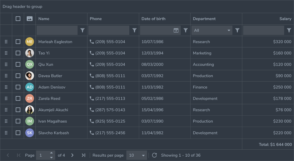
ReactDataGrid is packed with all the functionality you would expect from an enterprise-grade grid.
As stated before, the ReactDataGrid is built with React in mind, so it supports popular patterns in the React world: controlled/uncontrolled props, render props, built with immutability from the ground up etc.
Here's a list of the features that we support for each edition:
- Remote data source
- Sorting
- Pagination
- Inline edit with custom editor support
- Filtering with built in filters
- Stacked columns
- Context menu integration
- Rowspan and colspan
- Row selection
- Cell selection
- Keyboard navigation
- Customizing rows, cells and headers
- Scroll customization
- RTL support
- Beautiful themes
- Column reorder
- Column resize
- Live pagination
- Grouping
- Locked columns - start and end
- Row details
- Pivoting
- Row resize
- Row reorder
- Footer
- Locked rows - top and bottom
- Master-Detail
- TreeGrid
Besides the above, there's a lot more backed into the ReactDataGrid, so make sure you explore our documentation.
The Enterprise Edition is a commercial product and it requires a commercial license - please visit the pricing page for more details. Once you buy a license, we'll provide you a license key, so you can start using the ReactDataGrid Enterprise Edition in your apps.
You are free to evaluate the Enterprise Edition of the ReactDataGrid even without a license key - all the features are available and ready to use, but a license notice will be displayed initially for a few seconds. If you want to remove that, you can contact us and we'll send you an evaluation license key which you can use for 30 days.
Please note you are not allowed to integrate the Enterprise Edition of the ReactDataGrid into end products or use it for any commercial, productive or training purpose without a valid commercial license. Read EULA for more details.
After you purchase and receive your commercial license key, you have to set it in the licenseKey prop then you can start using the ReactDataGrid in development and production.
import ReactDataGrid from '@inovua/reactdatagrid-enterprise';
import '@inovua/reactdatagrid-enterprise/index.css';

<ReactDataGrid licenseKey="..." />;
Even without a license key, all features are unlocked so you can evaluate the ReactDataGrid and decide whether you need the Community Edition or the Enterprise Edition.
We're heavily invested into our documentation - it ships with full working examples and a live editor. Each prop ReactDataGrid supports has it's own description and usage example.
Additionally, each feature is clearly presented and has a dedicated page that explains the feature and shows examples of real-life usage. See for example sorting, filtering, grouping etc.
import React from 'react';
import ReactDataGrid from '@inovua/reactdatagrid-enterprise';
import '@inovua/reactdatagrid-enterprise/index.css';

const columns = [
  { name: 'name', header: 'Name', minWidth: 50, defaultFlex: 2 },
  { name: 'age', header: 'Age', maxWidth: 1000, defaultFlex: 1 },
];

const gridStyle = { minHeight: 550 };

const dataSource = [
  { id: 1, name: 'John McQueen', age: 35 },
  { id: 2, name: 'Mary Stones', age: 25 },
  { id: 3, name: 'Robert Fil', age: 27 },
  { id: 4, name: 'Roger Robson', age: 81 },
  { id: 5, name: 'Billary Konwik', age: 18 },
  { id: 6, name: 'Bob Martin', age: 18 },
  { id: 7, name: 'Matthew Richardson', age: 54 },
  { id: 8, name: 'Ritchie Peterson', age: 54 },
  { id: 9, name: 'Bryan Martin', age: 40 },
  { id: 10, name: 'Mark Martin', age: 44 },
  { id: 11, name: 'Michelle Sebastian', age: 24 },
  { id: 12, name: 'Michelle Sullivan', age: 61 },
  { id: 13, name: 'Jordan Bike', age: 16 },
  { id: 14, name: 'Nelson Ford', age: 34 },
  { id: 15, name: 'Tim Cheap', age: 3 },
  { id: 16, name: 'Robert Carlson', age: 31 },
  { id: 17, name: 'Johny Perterson', age: 40 },
];

export default () => (
  <ReactDataGrid
    idProperty="id"
    columns={columns}
    dataSource={dataSource}
    style={gridStyle}
  />
);
Our documentation contains hundreds of running examples, so please make sure you check that out.
It’s already been used by thousands of users in business-critical apps, so you can trust it from the get-go. Our clients are building their apps with the ReactDataGrid at the core of their products.
With the help of the ReactDataGrid, provided by Inovua Software Technologies, we have been able to offer our customers the perfect support for state-of-the-art data management in our fleet management solution WEBFLEET.
--Thomas Boehm, Senior Engineering Manager at Webfleet Solutions, a Bridgestone Company
Enterprise-grade Datagrid component with outstanding feature coverage and second-to-none performance made it a straightforward decision to include it in our cloud-centric on-demand solutions.
--Yuri Genin, Lead UI Architect at PROS
