You signed in with another tab or window. Reload to refresh your session.You signed out in another tab or window. Reload to refresh your session.You switched accounts on another tab or window. Reload to refresh your session.Dismiss alert
Starting from the ground up with a holistic redesign of the UX and visual design of the app.
Home page
The home page greets a returning user with their profile image and username. It displays shortcuts to up to the most recent 3 projects in a scrolling section at the top of the page. Underneath, a list of categories from which to narrow down selections, or a "Browse all projects" button to find everything in one place.
If a user is not logged in, a gentle text link lets them log in right away if they wish, or they can dive into the categories.
Note updated icons on the category buttons match the new buttons on the updated project home page.
Default view of the category page shows an alphabetical list of only active, mobile-native projects. A toggle at the top switches to viewing all projects.
Large icon next to the category name reinforces the use of these icons.
Project cards mirror new project cards on the project home page, showing a progress bar and icon from the first category the project applies to.
Every workflow type uses the same layout for consistency.
Classify layout
Subject image (or images) take up the entire width, maximizing space usage. Very tall images should be 50% of the screen height.
Multiple images in a subject are indicated with pagination dots and scroll horizontally.
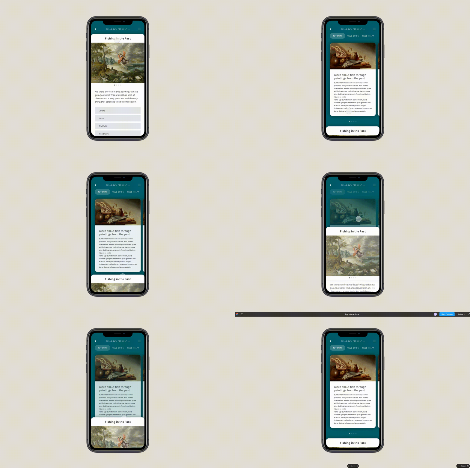
Images do not scroll with the rest of the content, removing the excessive amounts of scrolling currently occurring in the app:
Help content
The help content, metaphorically, has always got your back. It's right behind the classifier page – pull down or tap the down arrow at the top of the page to reveal it. Here, you'll be able to easily compare the subject image to examples by pulling the page back up:
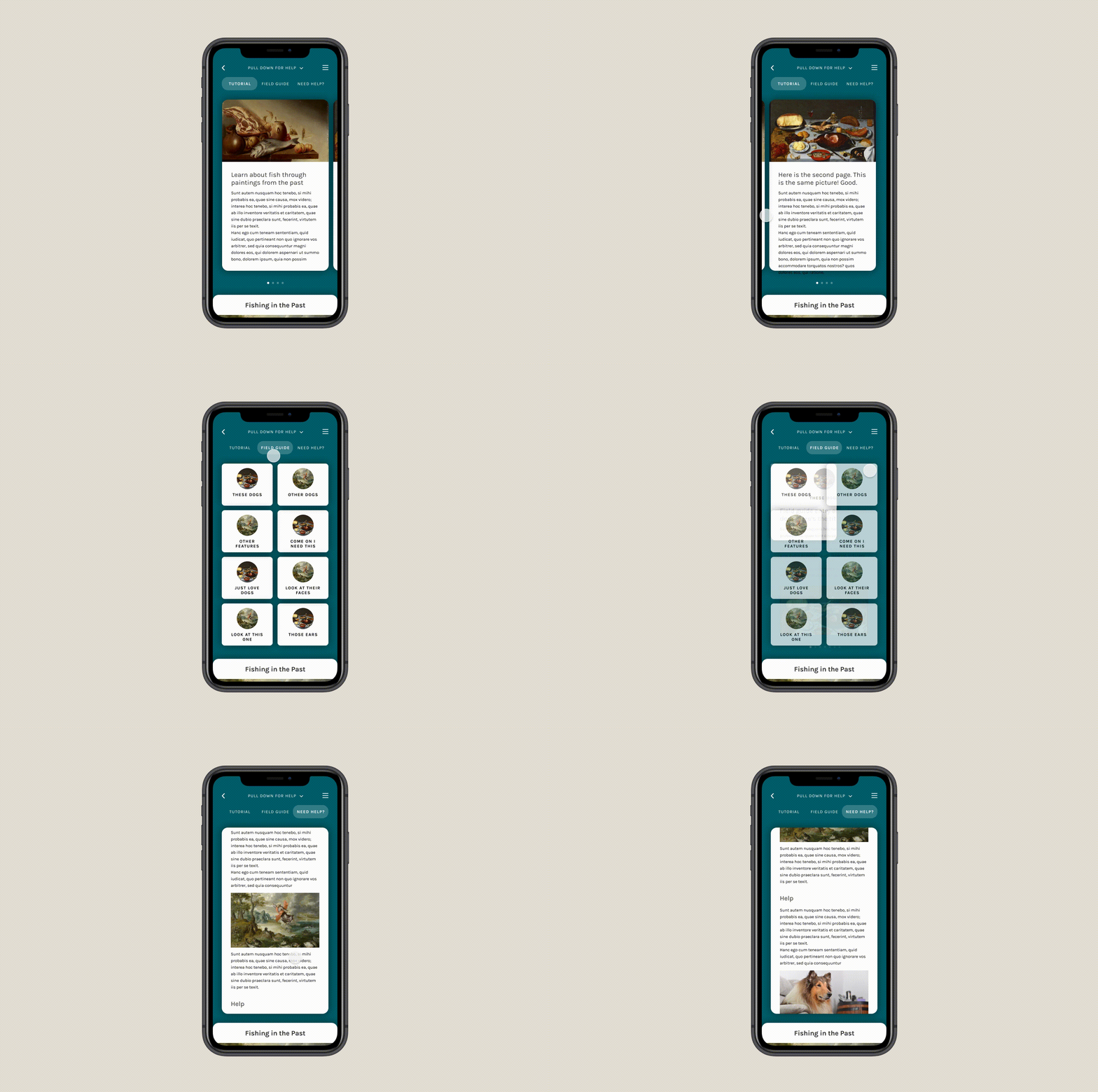
Swipe through the help tabs at the top of the screen to switch between Tutorial, Field Guide, and "Need some help with this task?"
Each tab includes Cards for easy navigation.
Swipe or tap the tab at the bottom to continue classifying.
Starting from the ground up with a holistic redesign of the UX and visual design of the app.
Home page
Links
Logged in: https://projects.invisionapp.com/d/main#/console/20526296/432731642/preview
Not logged in: https://projects.invisionapp.com/d/main#/console/20526296/432731471/preview
Category page
Link
https://projects.invisionapp.com/d/main#/console/20526296/432731643/preview
Classifier
Every workflow type uses the same layout for consistency.
Classify layout
Help content
The help content, metaphorically, has always got your back. It's right behind the classifier page – pull down or tap the down arrow at the top of the page to reveal it. Here, you'll be able to easily compare the subject image to examples by pulling the page back up:

Swipe through the help tabs at the top of the screen to switch between Tutorial, Field Guide, and "Need some help with this task?"

Each tab includes Cards for easy navigation.
Swipe or tap the tab at the bottom to continue classifying.
Links
Swipe: https://projects.invisionapp.com/d/main#/console/20526296/431169980/preview
Multi-answer: https://projects.invisionapp.com/d/main#/console/20526296/431169979/preview
Drawing: https://projects.invisionapp.com/d/main#/console/20526296/431169981/preview
Tutorial: https://projects.invisionapp.com/d/main#/console/20526296/432743639/preview
Field Guide: https://projects.invisionapp.com/d/main#/console/20526296/432743640/preview
Field Guide entry: https://projects.invisionapp.com/d/main#/console/20526296/432743641/preview
Need Help: https://projects.invisionapp.com/d/main#/console/20526296/432743642/preview
Help interaction/animation: https://www.figma.com/proto/Ro8roOPze4ZnadSpVg70SX/App-interactions?node-id=0%3A2&viewport=307%2C98%2C0.31268012523651123&scaling=min-zoom&hotspot-hints=0
The text was updated successfully, but these errors were encountered: