[THEME] VS Code Dark Plus #3485
-
|
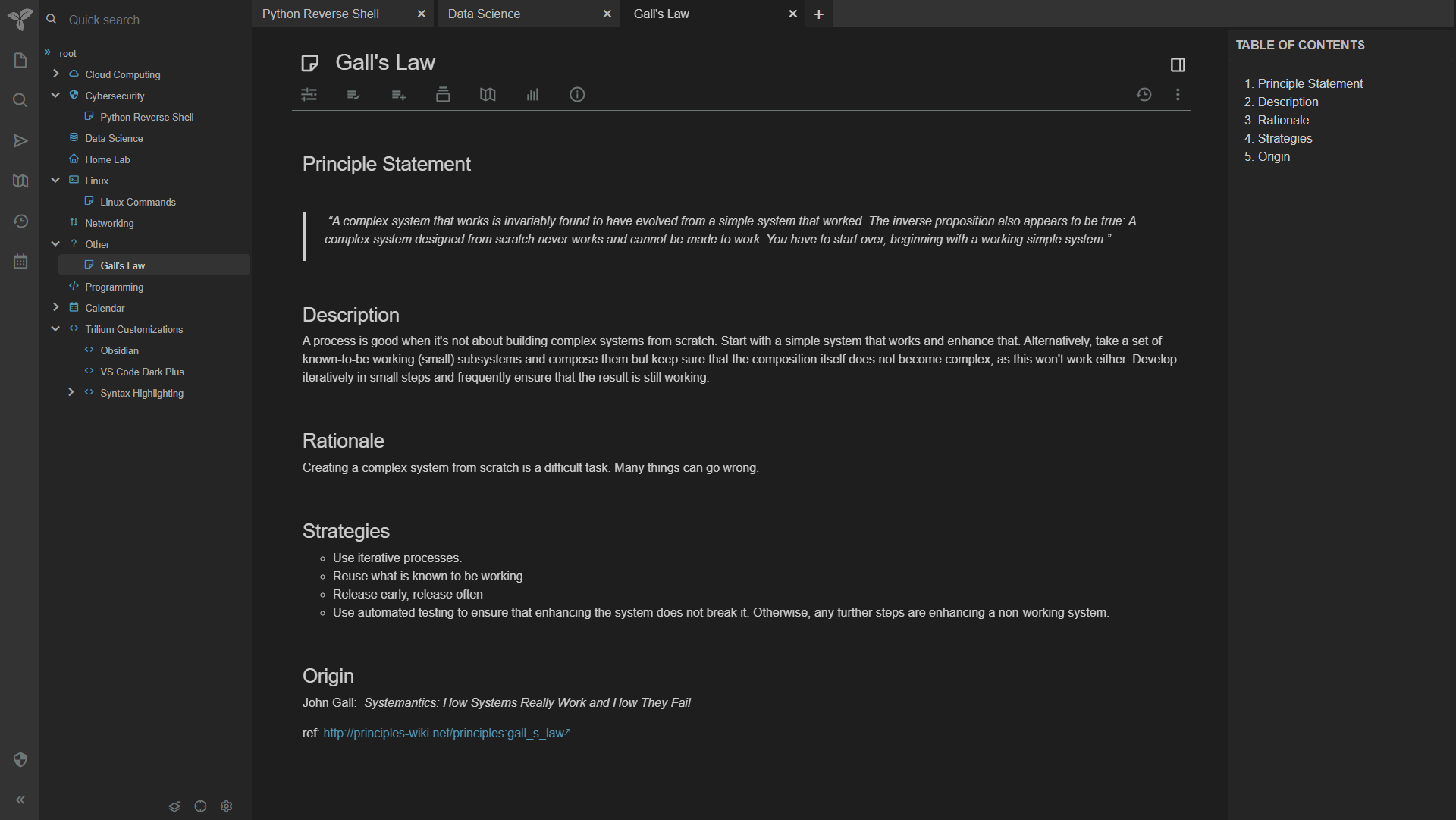
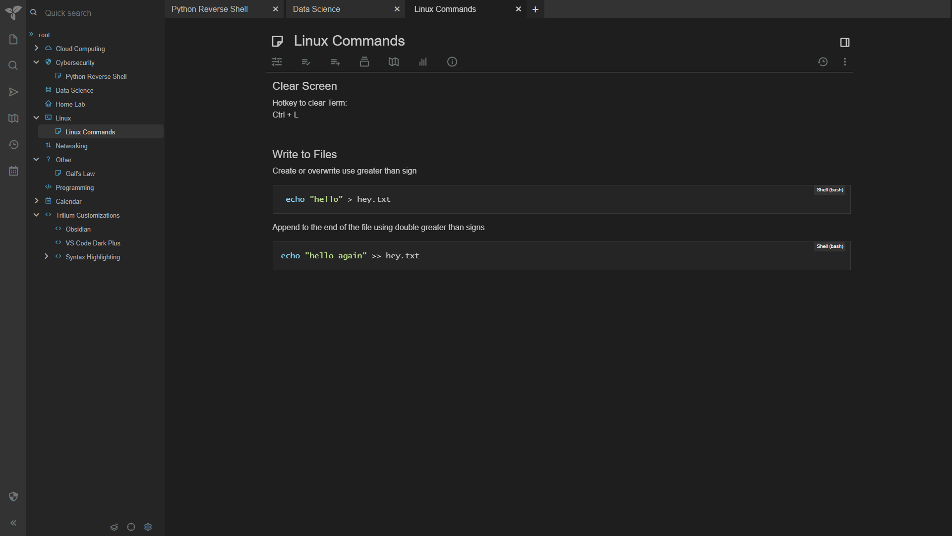
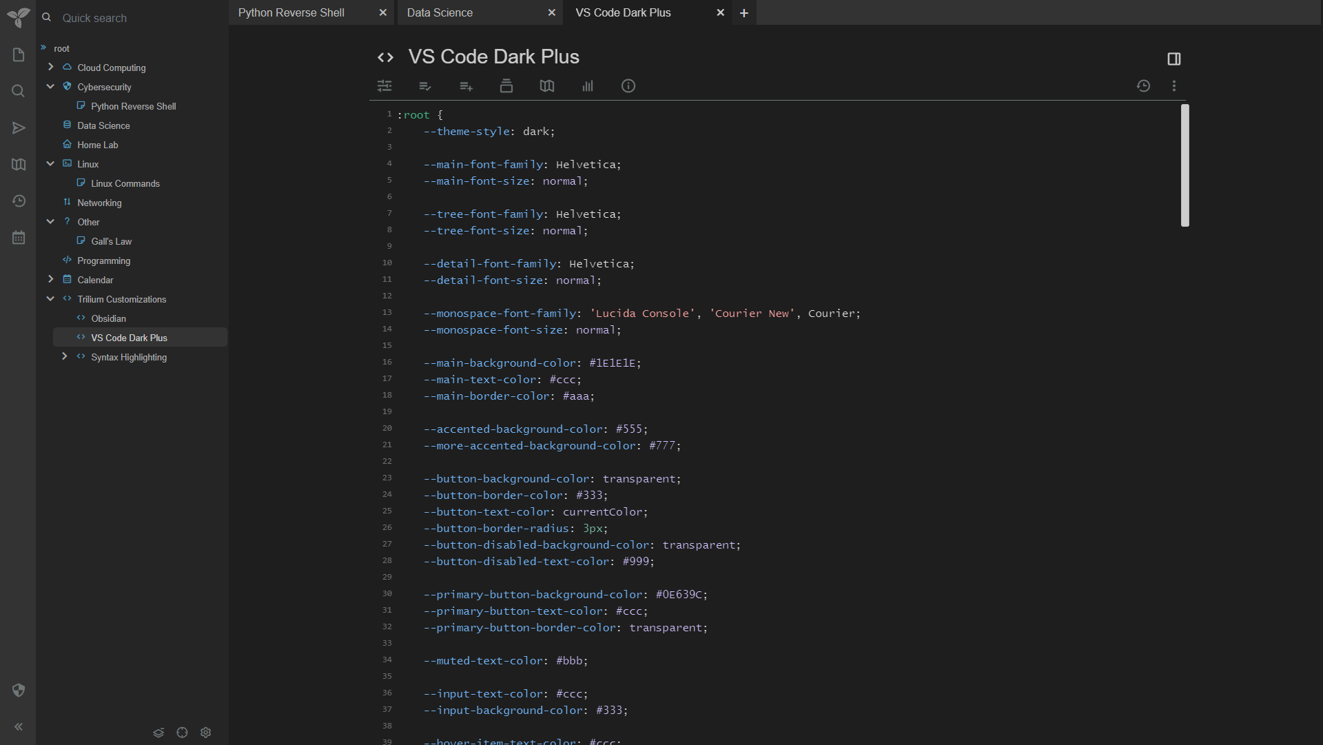
I really like Visual Studio Code's default dark theme called Dark+. While others have created versions of this theme, I have not been able to get them to work with the latest version of Trilium Server. I decided to give it a try. Please let me know if you have any comments or suggestions. Thanks! The theme can be found here https://github.com/greengeek/trilium-vscode-dark-theme Here are some screenshots. |
Beta Was this translation helpful? Give feedback.
Replies: 4 comments
-
|
Updated with some minor changes: Added additional spacing above the page title to make it easier to read and to put it closer to being at the same level as the root menu heading in the left bar. |
Beta Was this translation helpful? Give feedback.
-
|
Updated with a few additional minor changes.
Updated screenshots. |
Beta Was this translation helpful? Give feedback.
-
|
I've added your theme into https://github.com/Nriver/awesome-trilium. If you have more to share in the future, welcome to update the list. |
Beta Was this translation helpful? Give feedback.
-
|
Really love this theme, particularly how it makes the tree view more compact, that I can see more items in my tree view. Overall very nice, thanks |
Beta Was this translation helpful? Give feedback.


Updated with some minor changes:
Added additional spacing above the page title to make it easier to read and to put it closer to being at the same level as the root menu heading in the left bar.
Dimmed the controls below the page title to make the page feel less busy.
Slightly lightened the hyperlinks, so they are the same color as the icons on the left to make them easier to read and add a bit more contrast. (not shown in current screenshots).