-
-
Notifications
You must be signed in to change notification settings - Fork 94
New issue
Have a question about this project? Sign up for a free GitHub account to open an issue and contact its maintainers and the community.
By clicking “Sign up for GitHub”, you agree to our terms of service and privacy statement. We’ll occasionally send you account related emails.
Already on GitHub? Sign in to your account
Comments not different enough. #14
Comments
|
It is not easy to improve this when the theme engine is limited to defined JSON attributes only. In other port projects it is possible to improve this by using advanced theming features like Sass/LESSCSS/CSS. |
|
Really like this theme, but the comment color forces me to switch back to another theme after a while. 😢 |
|
Same here, only issue with this theme. |
|
Customize a theme via settings and impement a API for theme authors are one of the most requested VS Code features as you can see in Microsoft/vscode #11556 and Microsoft/vscode #459. It seems like the team is going to refactor the current JSON format again as seen in the proof on concept PR Microsoft/vscode #21981. I hope they implement it the great way like the Atom team did which may allow me to implement accessbility settings or at least users can adjust themes to their personal needs. |
|
Comment color is my only issue with this theme, everything else is fantastic. While certainly not the best way, you can also change the comment color in nord.json in 0.2.0 Search for "Comment" (with the quotes) and change the foreground value (~line 150). I use #717C96 |
|
Can we get a temporary fix for this? |
My fix is to switch to another theme every once in a while .. :| |
|
Sorry for my late reply, haven't got the time to work on any private projects the last months.
Honestly there is nothing that needs to be "fixed", it's a personal preference. The color has been chosen to keep the focus of the user on the code by "fading out" comments/docs. It works fine if the settings of the monitor are correct regarding the contrast and brightness based on environment. I've got a lot of requests in other ports projects too, but unfortunately VS Code is still not able to provide custom settings per extension compared to other editors which allowed me to implement a "accessibility" setting where the user can increase the contrast using percentage values. Anyway, I've added this card regarding Microsoft/vscode #27894 which finally allows users to override syntax (token) colors using a |
|
I just want to clarify that I don't want to blame anyone for having bad monitor settings or general setup, just the fact that the used color is adjusted to the theme. I'd really like to solve this to make this theme usable for all kind of personal preferences, but it relies to the VS Code development team to implement a way for theme authors to provide customization settings or at least allow to override theme settings. There is a PR which implements the new token color override feature which I'll keep track of. The backlog card now also links to the PR which I'll track. |
|
microsoft/vscode#29393 has been merged and can be tested with the latest Insiders build! To change the color of all comments for the Nord theme you can add this to your "editor.tokenColorCustomizations": {
"textMateRules": [
{
"name": "Comment",
"scope": "comment",
"settings": {
"foreground": "#4C566A"
}
}
]
}...and replace the current comment color This is a reference table if you'd like to use the same increased contrast values as provided by the Nord Atom Syntax accessibility custom comment contrast theme setting feature which are calculated using the LESSCSS
|
|
Just a small update, microsoft/vscode#29393 is now available also in stable channel, release 1.15. |
|
Making this change in my own version since release 1.15 has been a marked increase in usability for me! Thanks for a great color scheme. |
|
I still wish for 5% |
|
@ajitid I've researched the API documentations and maybe there's a way to implement a theme settings to provide a way for users to set a percent value the comment colors will be increased by. Changing the default color would affect all Nord port projects since I've to adapt the change to all of them. Maybe I'll start a vote poll for it and if most users would like to see the comment color to be increased by default I'll adapt it. |
|
@arcticicestudio https://github.com/equinusocio/vsc-material-theme has a setting you can access by Cmd + Shift + P -> Material Theme: Settings. Users can use it to change color accents and color variants. Maybe you can also do something similar. |
@octref Thanks for the link, the Material Theme uses the same way of the API I've also found, it's a bit "hacky" and I think not meant to be used this way, but until they extend the theme API to provide this functionality it might be the only way to implement such a feature. |
|
I've increased the comment color by Note that this will not affect Nord itself, the color palette won't change, it'll be changed in the documentation and style guidelines. Also, each port project that has the capability to provide theme settings (like Nord Atom Syntax & UI, Nord Vim, ...) will get some kind of legacy comment color mode to not break the theme for users that like the current comment color. I'll create a vote thread in the Nord repository within the next weeks to get some feedback from all users of all port projects and to decide the value which should be between |
|
This reminds me of an Emacs function I wrote many years ago to darken/light Javadoc, also fold/unfold all Javadoc in a file, because Javadoc tended to be very verbose. I believe the motivation for the default is (was?) precisely something in that line, to deemphasize docs and comments and let the code get the focus. Problem is sometimes you need to read the comments, sometimes you need to read the docs, and sometimes you are the one writing comments and docs! You need to see them clearly in those use cases. Thanks for the table with %s above! |
|
Note that starting with version 1.20 of VS Code, the customization can be scoped to the theme: "editor.tokenColorCustomizations": {
"[Nord]": {
"textMateRules": [
{
"name": "Comment",
"scope": "comment",
"settings": {
"foreground": "#5d6982"
}
}
]
}
} |
|
@arcticicestudio Thanks for the settings.json instructions and the color table override. Nord is perfect now. Love the theme |
|
I didn't have to use the "textMateRules" thing any more. |
|
@octref There's #105 that I'd like to merge before deploying the next version, but I'm currently also stuck at solving this problem. If there would be theme scopes that would allow to explicitly style elements that are highlighted in a diff-view I could simply adjust all colors, but there's no good style that creates a nice coloring for both diff and normal views. By the way, the long-time problem with comments has been solved in #118 (#117) and will also be included in the next release 🎉 |
|
I opened microsoft/vscode#71663. |
|
@octref Thanks 💚 |
|
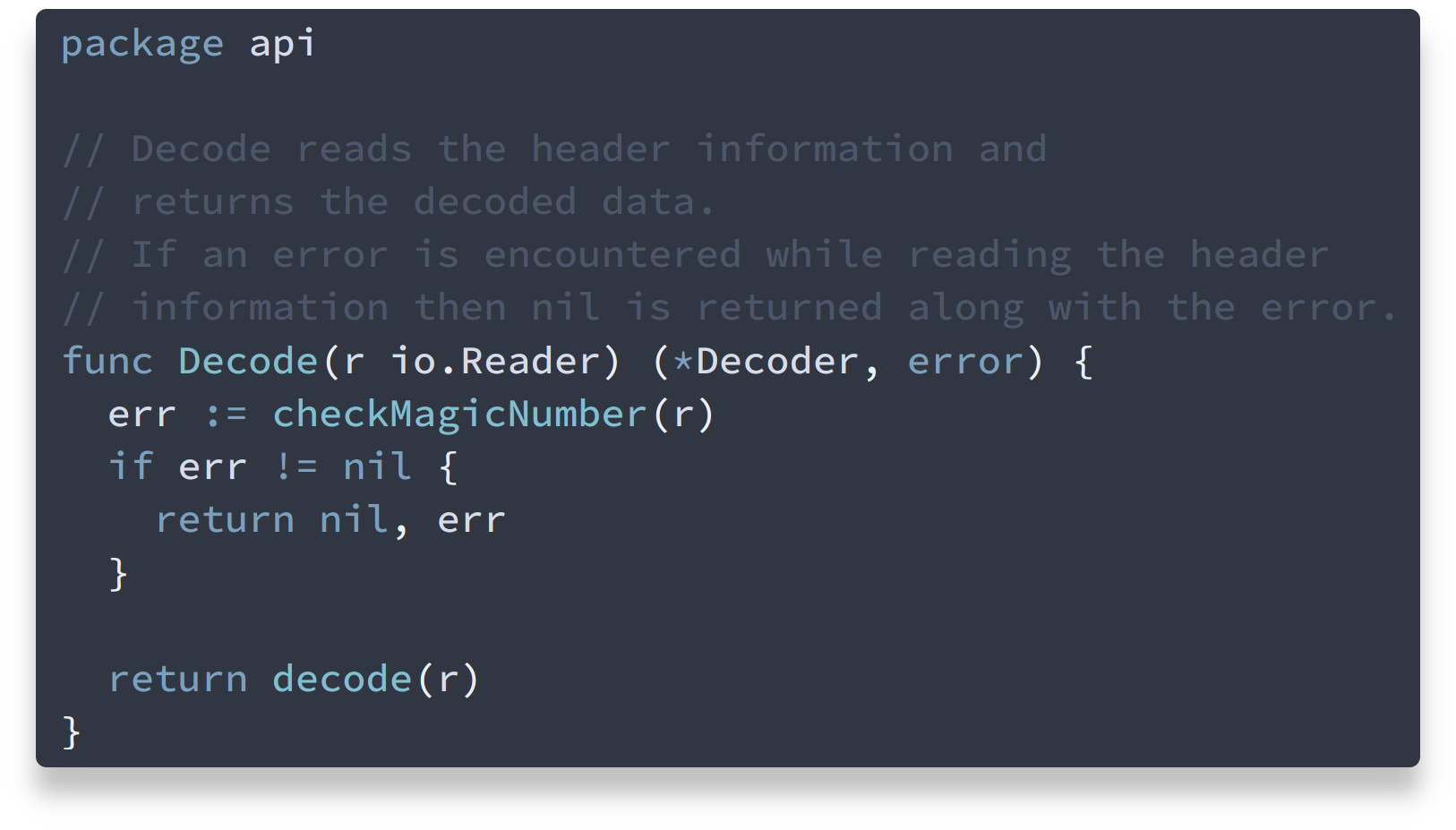
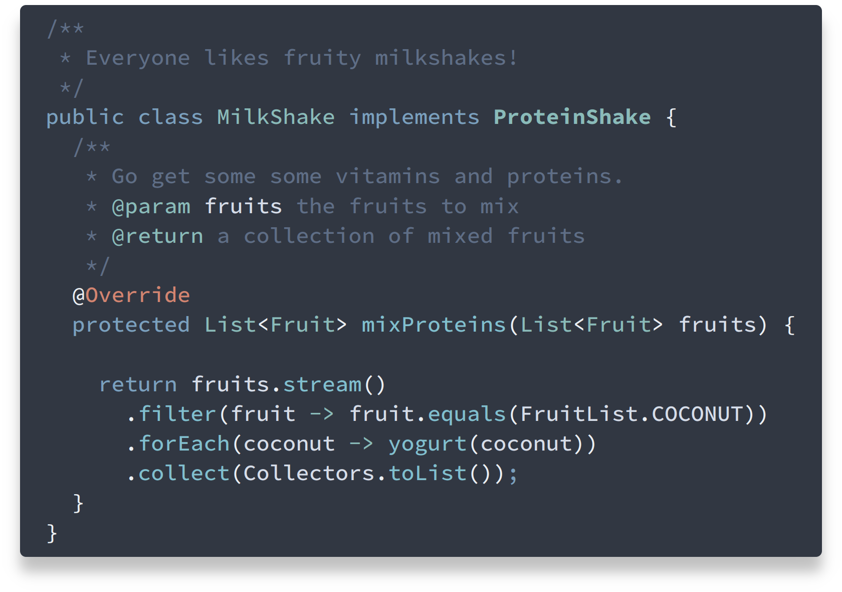
Alright, its finally time to close this long-time issue 🎉 PR #118 (implementing nordtheme/nord#94 through #117) has been merged and version 0.8.0 has been release and deployed to the VS Code Marketplace 🚀 The comment's color brightness ( Feel free to let me know what you think about this change! BeforeAfter |


I know that much of a user's preference when it comes to a theme can be driven by small changes in the settings of their display. So if others aren't experiencing the same, I apologize.
I find that on my display, and many of my coworkers' displays, the different between comments and the background color is not substantial which causes the comments to be difficult to read when the lighting in the office isn't perfect.
I know that it's not as simple as lightening up the comment (and token) color as that might interfere with the line highlight color but I hope you can find a solution that would make it just a little easier to read.
The text was updated successfully, but these errors were encountered: